Katrina & Nick’s side extension
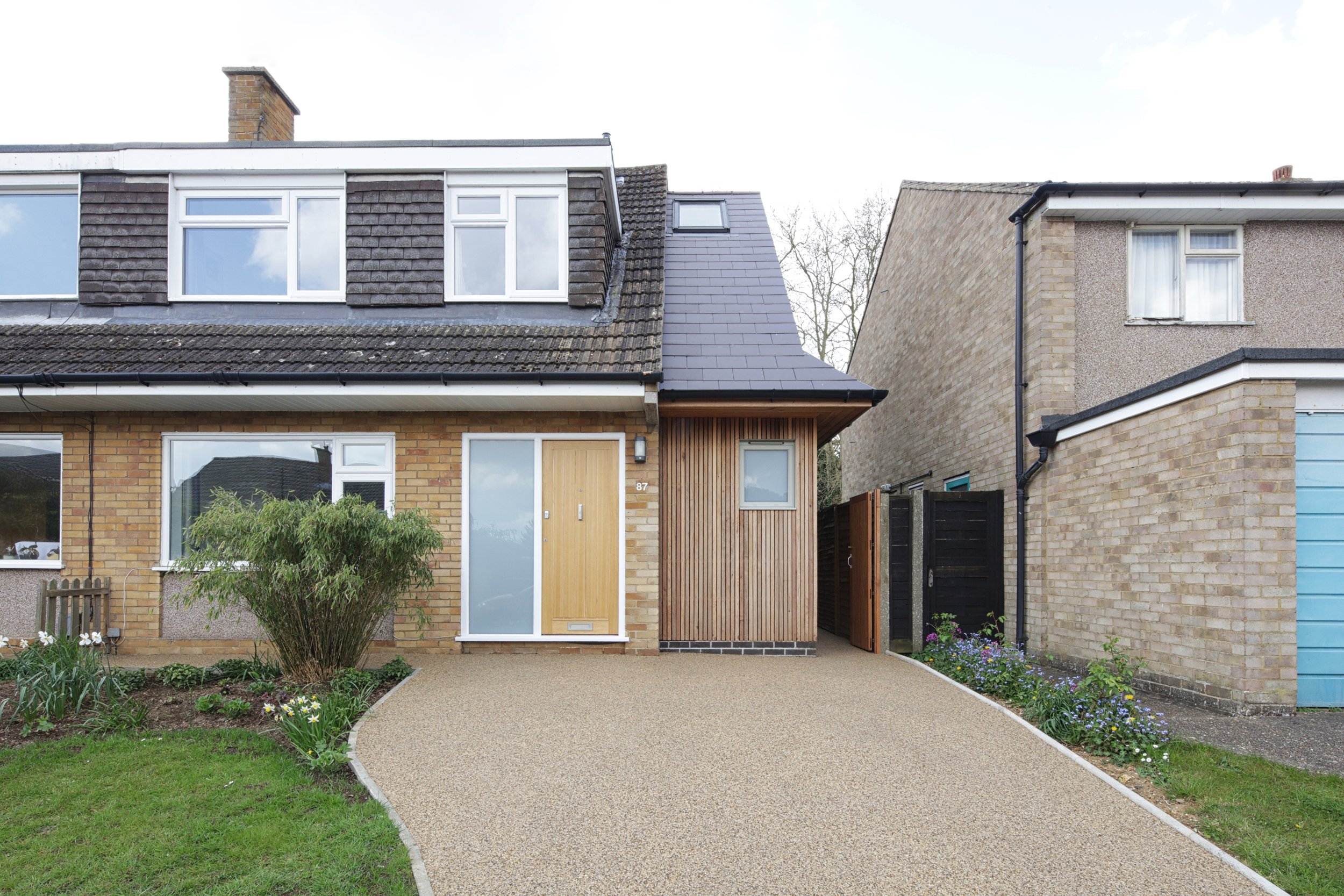
A skinny, two-storey side extension to a semi-detached, late 1960s Wimpey chalet style house in Hitchin, Hertfordshire.


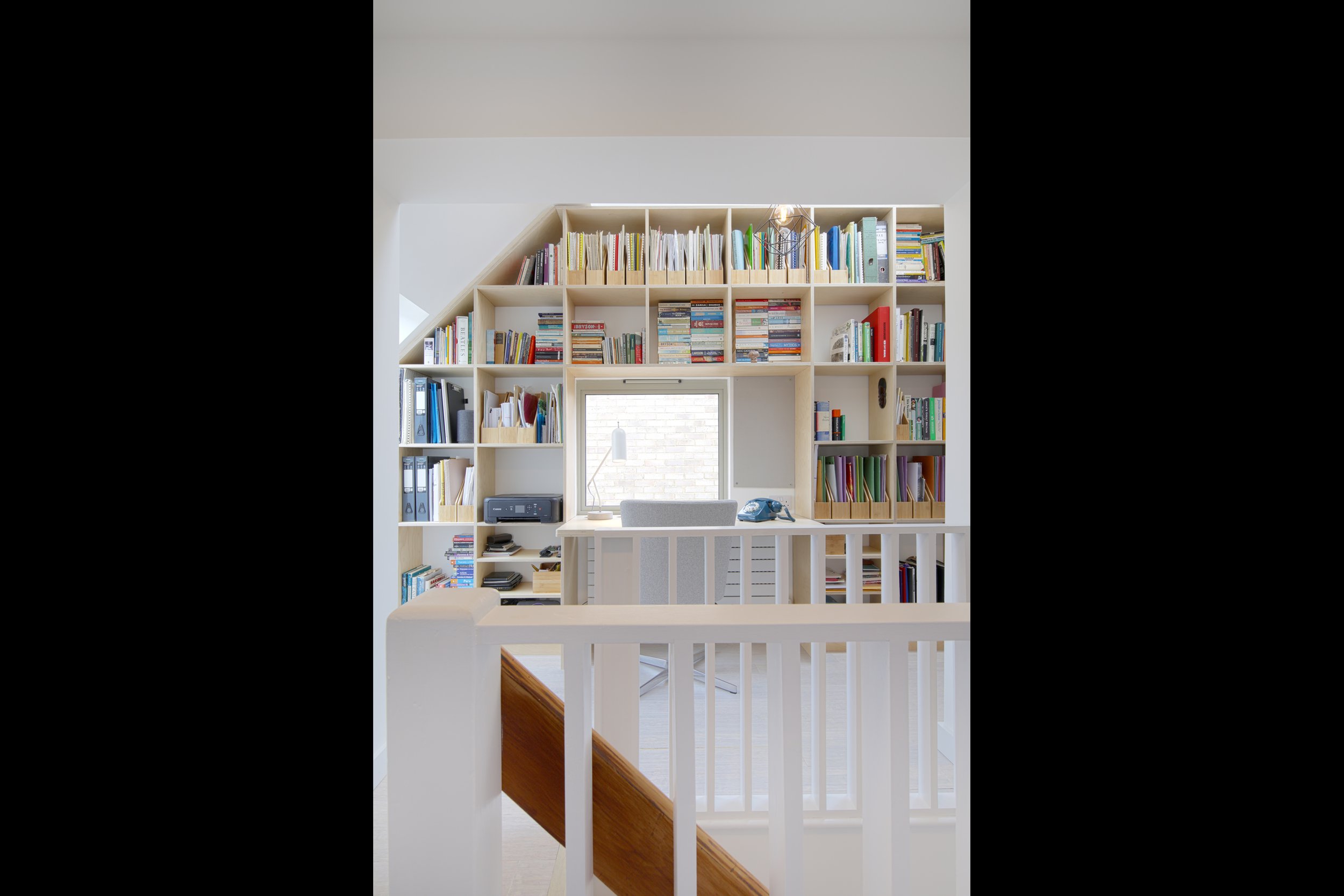
Inspired by contemporary compact houses on tight sites in Tokyo, the extension works hard within physical and Planning constrictions to create a utility room and guest WC on the ground floor and an office/library on the first, at just 1.5 m wide!
The existing house is of a standard type with steep double-pitched roofs with deep eaves and wide front and rear dormers with flat roofs that were mass built across Britain in the 1960s. Many of these houses have been altered and/or extended since, with single and two-storey extensions added to the side and rear. Generally, two-storey side extensions to these houses are extrusions of the side, gable elevation, with wider front elevations, wider pitched roofs, and wider dormers. These extensions can result in quite bulky massing, particularly when both houses of a semi-detached pair have been similarly extended, and require quite a lot of work to open up the existing houses to make kitchens and bedrooms larger.
The proposed scheme offers an alternative model for extending these houses, by stepping back the front and rear elevations, maintaining the eaves height, and stepping down the ridge so that the new extension is subservient to the existing house. The new extension is constructed with a well sealed and insulated timber frame. Externally, on the ground floor this is clad with lacquered western red cedar vertical battens to tone with the existing sandy brown coloured brickwork walls and further reduce the apparent mass. On the first floor this is clad with dark brown fibre cement slates with crisply detailed close mitred hips and gables to tone with the existing dark brown profiled concrete tiles for the same reason. The new extension provides additional spaces instead of trying to make existing ones larger. Internally, the extension simply plugs into the existing house with a new door in the hallway at the bottom of the stairs to the utility room and a new opening on the landing at the top to the office/library. A glazed door and floor to ceiling window in the utility room increase the width at critical points. Similarly a desk level window in the utility room makes the space appear wider, a low level rooflight at the rear provides a view across the back garden to trees and a high level rooflight at the front draws views up to the pitched ceiling and the sky. A built-in desk and wall of shelves made with oiled birch plywood in the office/library emphasise the narrow width while maximising the use of space.
Photography by Tom Cronin